Checking in on our Battery Savings
When I last wrote about our Solar Battery Savings, we had just moved onto a battery charge schedule which involved two daily grid-charges. The underlying idea being that this should help to unlock additional savings by shaving both the morning and evening price peaks.
Aside from occasional temporary changes during Octopus Power-ups, the schedule has remained the same for a little over a month, so I thought it was worth reviewing how it has performed in that time.
In this post I'll talk about the savings performance delivered by our solar battery as well as possibly contributing factors such as fluctuations in energy prices and our usage patterns.
Weather
As before, let's start with the weather.
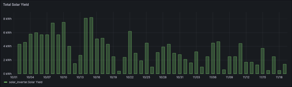
It's mid November, so sunlight, unsurprisingly is becoming an increasingly rare commodity:

As a result, daily solar yields have been pretty low this month, with 4kWh now being considered a "good" day:
For ease of comparison, the median daily output across the last few months is
- September:
5.45kWh - October:
2.5kWh - November:
1.75kWh
All a far cry from earlier in the year.
Charge Schedules
We have two scheduled charges: 1am - 6am and then another between 11am and 4pm.
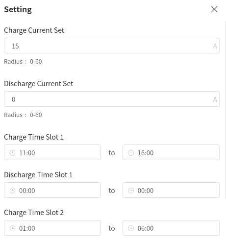
These are timed to end just before prices normally start to peak and mean that, in each 24h period, we spend at least 10 hours charging the battery (with all other household load during that time also drawing from the grid).
The approach to charging that I've chosen is not entirely dissimilar to the concept of pound-cost averaging in finance. The underlying idea being that you shouldn't attempt to "time" the market too much, and should instead spread your investment over time in order to achieve a good average price.
Of course, electricity pricing is not quite the same thing, because we have the benefit of a little more foresight: by around 5pm I know what the next day's Agile prices are going to be.
But, once the cost of my time has been factored in, it doesn't quite seem worth the effort of reviewing charge schedules daily (I really must get around to building the kit needed for automation though. I might get the ball rolling by writing a script that emails me only on days where substantial changes seem justified).
Achieved Savings
There continues to be quite a bit of fluctuation in the savings enabled by the battery each day. Negative savings are rare, but do still happen:
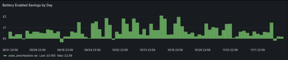
Some (but not all) of the bigger spikes are the result of Octopus Power-ups, which we'll come back to below.
If we look at a graph of weekly savings, we can see that rates peaked just after my previous post and have been reducing ever since (the final slot in the graph is an incomplete week, but the trend is clear)
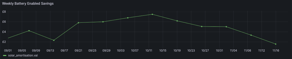
I've not really changed anything this month, so what gives?
Octopus Power-up Frequency
My first thought was that we might simply have had more Octopus Powerup events in October - they've certainly felt less frequent recently.
When Powerup events occur, I override the recorded electricity price by inserting records into InfluxDB:
point="octopus_pricing,tariff_direction=import,charge_type=usage-charge,payment_method=None,reason=octopus_powerup override_price=0.0 ${timestamp}"
This makes checking the historic frequency of powerups quite easy:
SELECT
   count("override_price") as "minutes"
FROM "Systemstats"."autogen"."octopus_pricing"
WHERE $timeFilter
GROUP BY time(30m) fill(null)

Whillst it's true that Powerups have not been as frequent this month, we have had some longer ones (there were a couple of 4 hour slots - if you look, the lines in the graph are thicker). They also weren't frequent enough in October to be able to have skewed the savings too strongly.
So the change in weekly savings is unlikely to be driven (much) by the availability of Power-ups
Octopus Pricing Deltas
With Powerups removed from the equation, the answer to the reduction in savings is almost certainly that the gap between minimum and maximum electricity prices has narrowed.
Grid-charge savings are achieved by charging when energy is cheap(er) and then discharging when grid prices are higher, with the saving being the difference between the two.
By luck, recently I created a report focused on comparing agile prices to our usage.
The dashboard powered by this report includes a chart showing minimum and maximum prices per day:
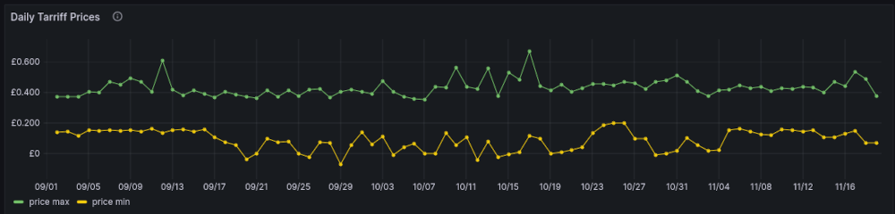
(Note: This ignores my pricing overrides, so Powerups are not accounted for).
Although the maximum price has been more stable, the minimum price has consistently remained higher this month than it was for most of October.
By tweaking the query slightly, we can have the chart show a delta instead
from(bucket: "Systemstats/rp_720d")
  |> range(start: v.timeRangeStart, stop: v.timeRangeStop)
  |> filter(fn: (r) => r["_measurement"] == "electricity_pricing")
  |> filter(fn: (r) => r["_field"] == "price")
  |> filter(fn: (r) => r["by"] == "day")
  |> filter(fn: (r) => r["price_type"] == "tariff")
  |> filter(fn: (r) => r["aggregate"] != "average")
  |> pivot(rowKey: ["_time"], columnKey: ["aggregate"], valueColumn: "_value")
  |> map(fn: (r) => ({
     _time: r._time,
     _field: "delta",
     _value: (r.max - r.min) / 100.0
  }))
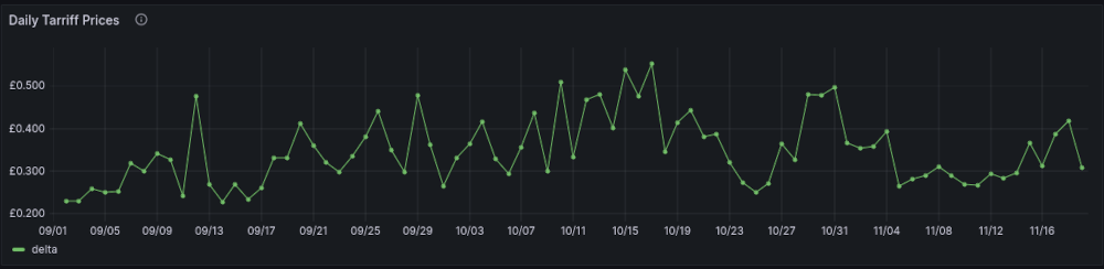
Although it's recovered a bit in the last few days, the difference between maximum and minimum prices has been much lower this month (and peaked around mid October - when the weekly savings peaked).
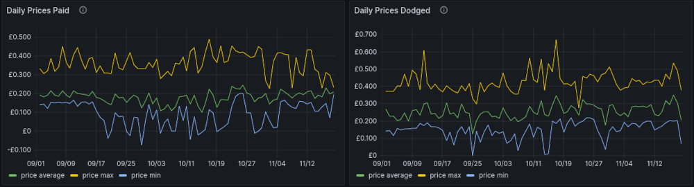
Although the reporting is currently imperfect, we can see a similar pattern if we compare a graph of prices paid to one of prices avoided (i.e. the ones that the battery saved us from)
Essentially, all of this means that the possible savings for any given kWh of electricity have been smaller: Although maximum prices are lower (this is a good thing), the minimum prices at which we can buy units of energy is higher, reducing our potential profit margin.
Usage
Of course, the reduction in savings may not be driven by pricing changes alone.
Shifts in our behaviour could mean that we're no longer making optimal use of the battery: perhaps consuming energy at different times (and therefore, different prices).
That's not necessarily a bad thing, if it results in lower overall energy bills as a result of us doing high energy stuff at low(er) prices rather than drawing from the battery.
We can gauge whether this is the case by using this (slightly complicated) histogram
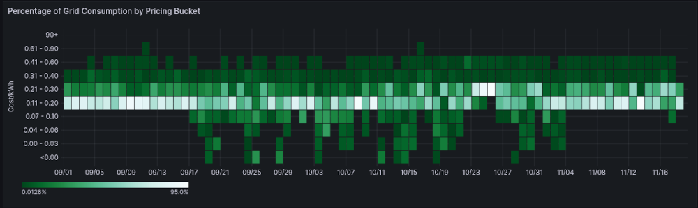
The Y-axis consists of energy unit costs - how much per kWh. The colour scale indicates what percentage of that days grid-bought energy was bought at that price-range, with lighter colours indicating a higher percentage (so we want the brightest colours to be as far down the graph as possible).
We can see that, with some exceptions, at least 70% of our grid energy is bought in at prices between £0.11/kWh and £0.20/kWh.
The most notable exception to that, is the period where our battery savings peaked - during that period, only around 35% was acquired at that price with most being acquired for less than that (allowing for a bigger potential profit margin).
The important thing, though, is that there's no marked change in colouring towards the right side of the graph, indicating that there have not been any material shifts in our usage (at least, in so far as it relates to pricing).
This is particularly important, because the amount of energy that we consume from the grid has been creeping up:
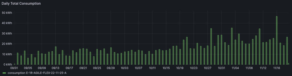
Some of this increase, of course, is because the battery is being charged by less and less solar energy.
Heating
A large part of the reason that our usage has increased, though, is that the evenings are getting colder.
We've got gas central-heating, but it's an old house, with quite a large living room: it can get quite cold in there of an evening and really needs some form of localised heating to help maintain a comfort level.
Last year, we used a portable gas fire for that.
However, bottled gas is much more expensive that mains-supplied gas:
- 1kg of propane or butane equals
14kWh - 13KG of Propane therefore represents
182kWh - A 13KG bottle is currently £52.50
- This gives a unit price of
£0.2885/kWh
So, outside of peak pricing, it actually makes more financial sense to use an electric heater (which, of course, also has the additional benefit of not filling the house with humidity and carbon monoxide).
That's exactly what we've been doing: I fitted a wall-mounted wifi-controlled convector near the sofa, which we use to help warm the living room in the evening.
During Octopus Power-up events, I've also been turning electric heaters (big and small) on in most rooms to help the house warm ahead of the central-heating schedule switching over to evening mode - using free green electricity to help reduce the amount of gas that we need to burn.
Conclusion
It still looks like we're on the right track with charging daily. Although there have been a couple of days with low or negative savings, the battery generally helps shave at least £0.50 off a day's bill.
As a result of minimum prices climbing, the savings that can be unlocked each day are getting narrower, with occasional low grid prices being delivered primarily by wind rather than solar farms.
We're using more electricity than this time last year, but that's partly because we're now using electric heaters rather than (expensive) bottled gas for localised heating (with the added benefit of leaving the gas available for much more interesting things).